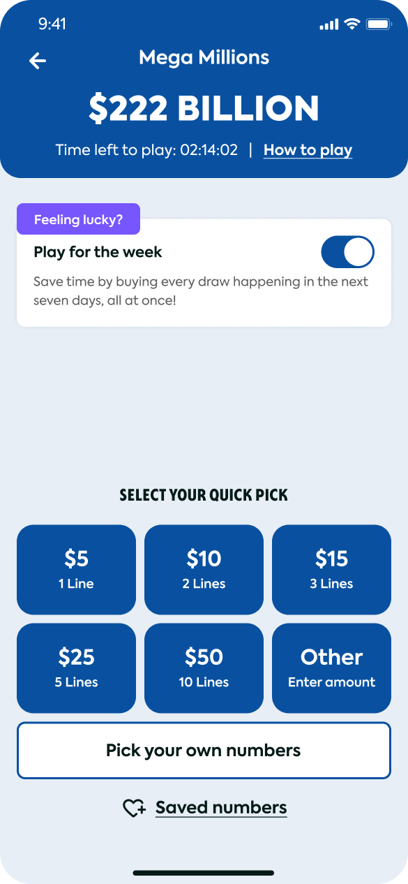
The Selection / Entry Screen
To onboard casual players unfamiliar with lottery mechanics, I visualized complex odds into a simplified Quick Pick interface. The screen surfaces only three primary decisions : game, amount, draw, and uses progressive disclosure to expose advanced options only when a power user reaches for them. Cognitive load drops sharply against the legacy multi-step flow.
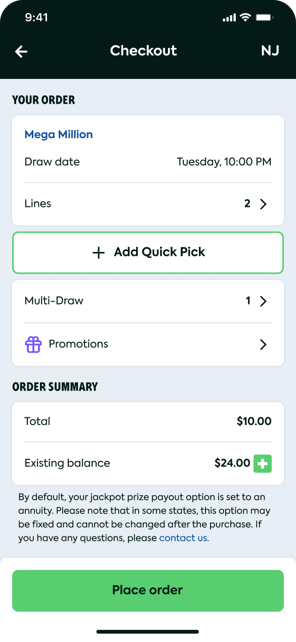
Hassle Free Automated Purchase
Play for the week lets users purchase the lottery in advance so they never miss the draw.
Quick Pick · 4-Button MVP
Launched as a 4-button Quick Pick interface based on initial user research — three primary decisions surfaced, advanced options progressively disclosed. The post-MVP Growth phase later took this layout to data-driven iteration.
Game Personalization
Users can save their favorite numbers and skip the number-picking for each game. Saved numbers are anchored to the Home Screen.
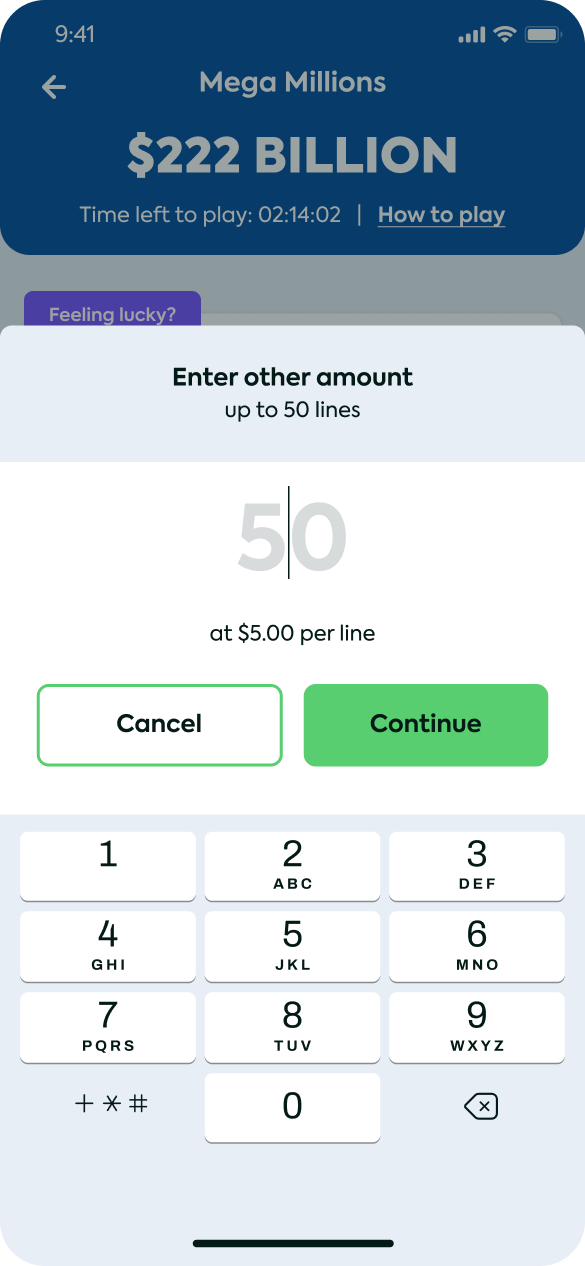
Large Amounts? We Got You
User can pick a desired amount of tickets from 0 to 50. For better UX I set 50 as the preset amount.
- End-to-End Onboarding Walkthrough: This walkthrough demonstrates the streamlined, high trust sign-up flow I designed for the iOS app, transitioning users directly into the core gameplay discovery phase.
- Hassle Free Automated Purchase: Play for the week lets users purchase the lottery in advance so they never miss the draw.
- Quick Pick · 4-Button MVP: Launched as 4 buttons based on initial user research — three primary decisions surfaced, with progressive disclosure for advanced options. The Growth phase later took this layout to data-driven iteration.
- Game Personalization: Users can save their favorite numbers and skip the number-picking for each game. Saved numbers are anchored to the Home Screen.
- Large Amounts? We Got You: User can pick a desired amount of tickets from 0 to 50. For better UX I set 50 as the preset amount.