Scroll
Case Study · Freelance ~6 min read · 5 chapters

Nonfiction · Growth Funnel Audit

Strategic ideas for APV and user acquisition, presented to the C-suite.

Nonfiction is a premium fragrance and skincare brand from South Korea. In May 2026, they opened their first North American flagship in NYC's SoHo. Ahead of the launch, the CEO asked me to audit the e-commerce experience and surface improvements that would make the in-store and online journey feel cohesive for a new market.

The desktop site was built for an Asian audience: Korea, Japan, and China made up most of the existing traffic, and it converted well there. But the same funnel left APV and acquisition opportunities on the table for North American shoppers, who don't share the same fragrance-buying conventions. I audited the funnel screen by screen, identified the highest-impact / lowest-engineering-cost interventions, and presented them to the C-suite in decks tailored to each leader's priorities.

The work is currently under review for prioritization.

  • Audit-first. Reviewed the desktop funnel across home, PDP, cart, and checkout. Surfaced eight intervention points.
  • Localization gap. The site read fluently for the existing Asian customer base but missed the conventions a North American shopper brings to fragrance discovery, copy density, navigation logic, and merchandising hierarchy all needed a different read.
  • APV strategy. Bundling, navigation rework for cross-sell, and first-time-customer coupons, all reusing existing components. No rebuild required.
  • Lightweight front-end only. No backend lift, no new infrastructure.
  • Stakeholder alignment. Presented tailored decks to all three C-suite stakeholders (CEO, CMO, CCO), each framed around their priorities.
Role
Freelance Designer · Growth Strategy
Date
2026
Stakeholders
CEO · brand integrity CMO · growth + CAC CCO · customer experience
Output
Desktop funnel audit Growth strategy decks · Presented to C-suite for prioritization

The Opportunity

Nonfiction's existing site worked. The desktop funnel: home → PDP → cart → checkout, just wasn't built for the audience the brand was about to acquire. Engineering capacity was tight, so every proposal had to come with a lowest-engineering-cost counterpart and a clear narrative for whichever leader would champion it.

APV Optimization

PDP cognitive-load reduction, listing-grid Add to Cart, and a navigation rework that turns the menu into a merchandising surface. Reuses existing components, no rebuild required.

Acquisition Hooks

Email capture rework — replace the intrusive home-page takeover with a subtle nudge, and recover missed users at the first checkout. Front-end-only lift.

APV Optimization · PDP

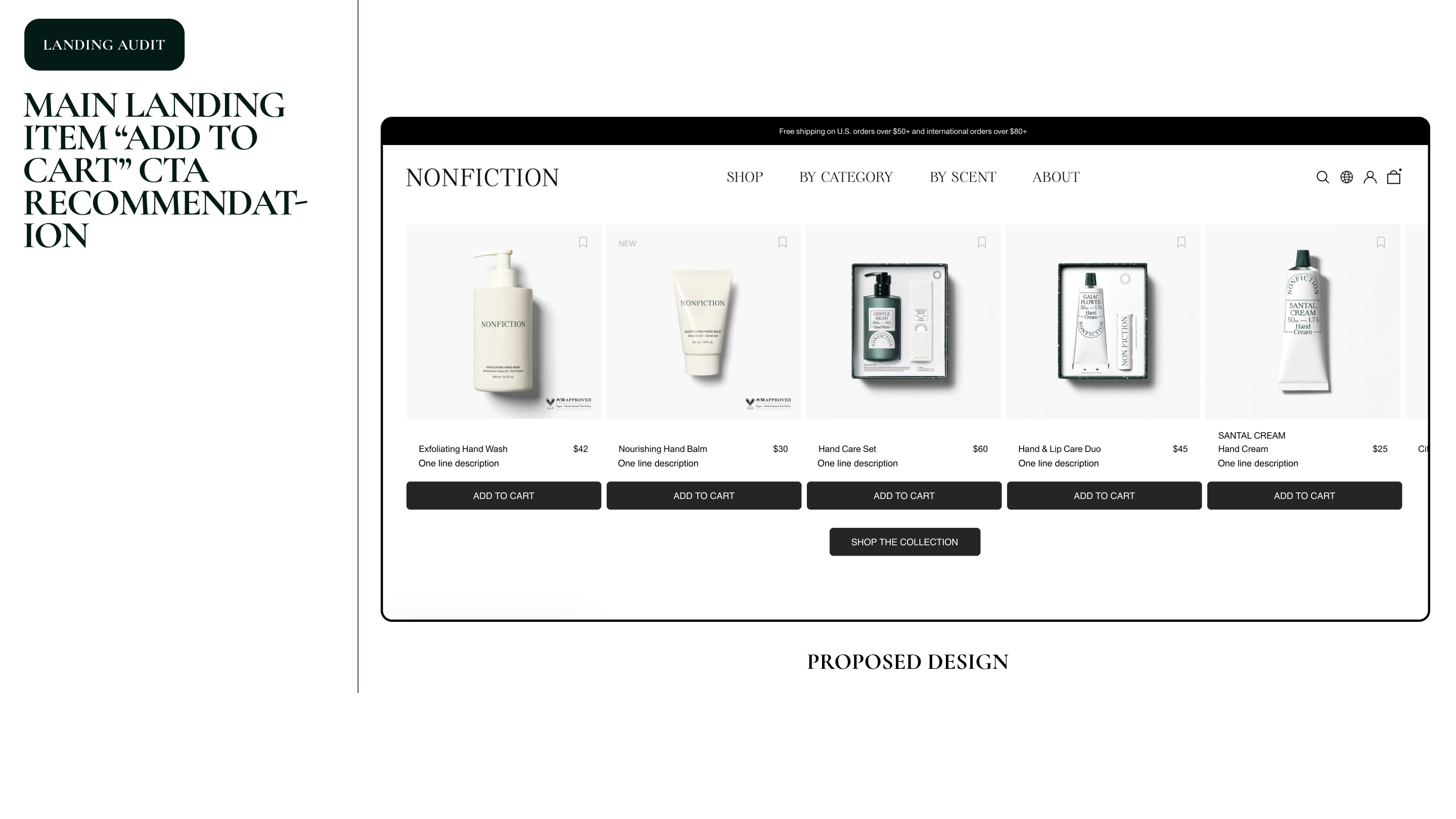
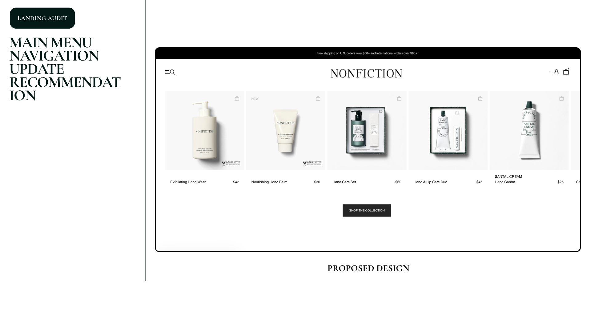
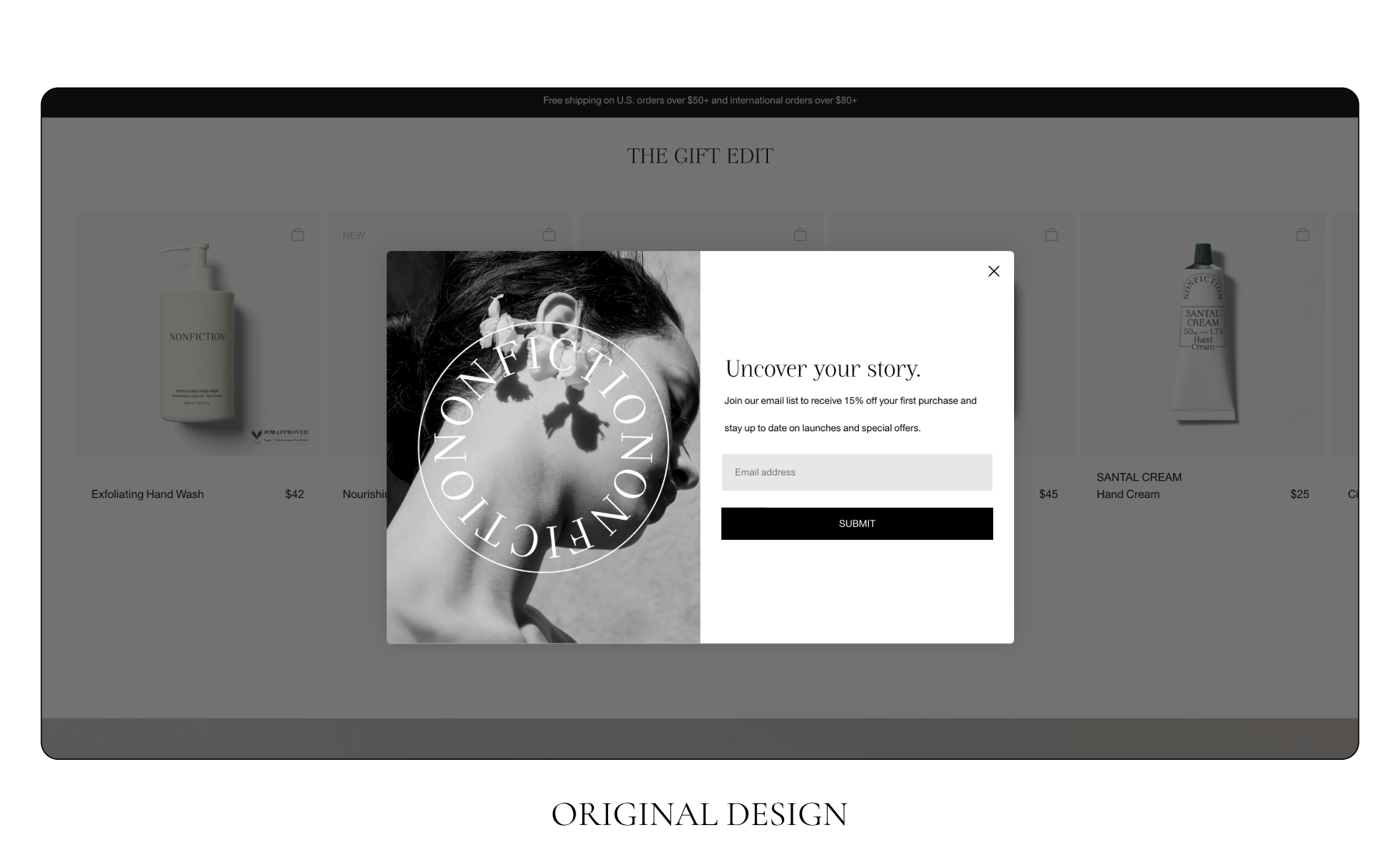
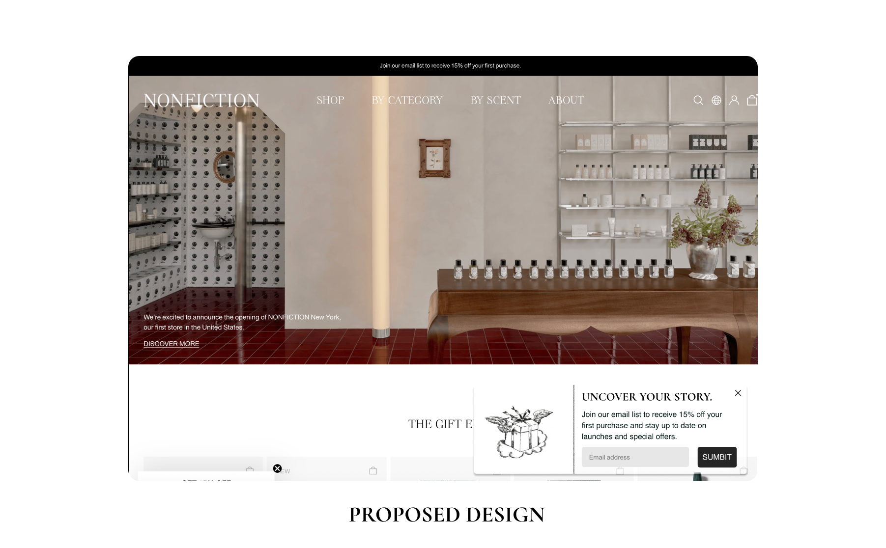
Reduce cognitive load on the path to purchase.

The desktop PDP was clean, but the primary call-to-action area was carrying more weight than it should. Add to Cart, Wishlist, and a long block of secondary details all competing for the same eye line. The proposal: tighten the conversion zone to two actions, and add an accelerated checkout method that returning users already trust.

+30–35% Estimated checkout success lift Based on prior accelerated checkout integrations at a previous company.
2 Primary CTAs in the conversion zone Add to Cart · Express Checkout.
1 Component relocated Wishlist moved up next to the product name.
The audit found

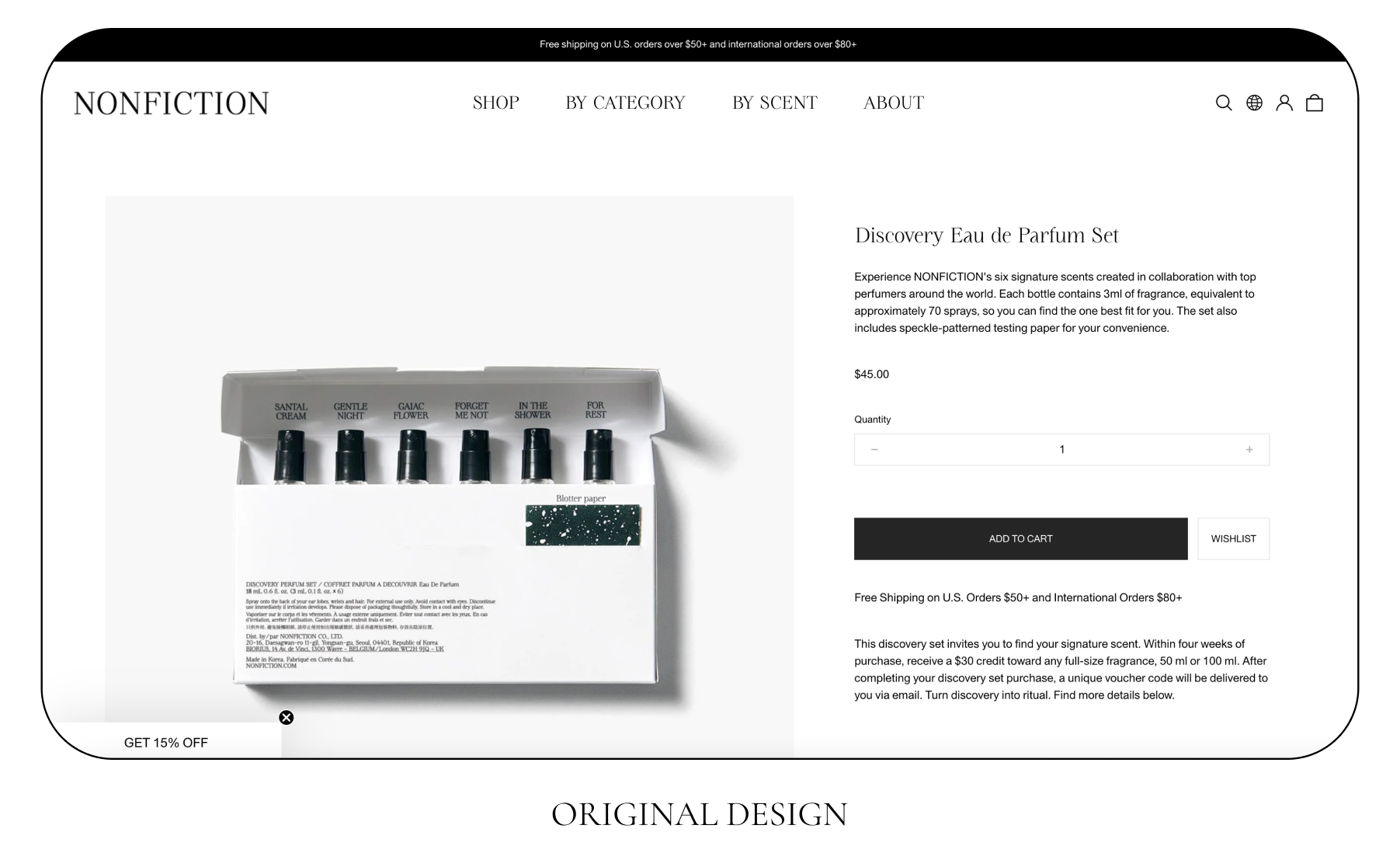
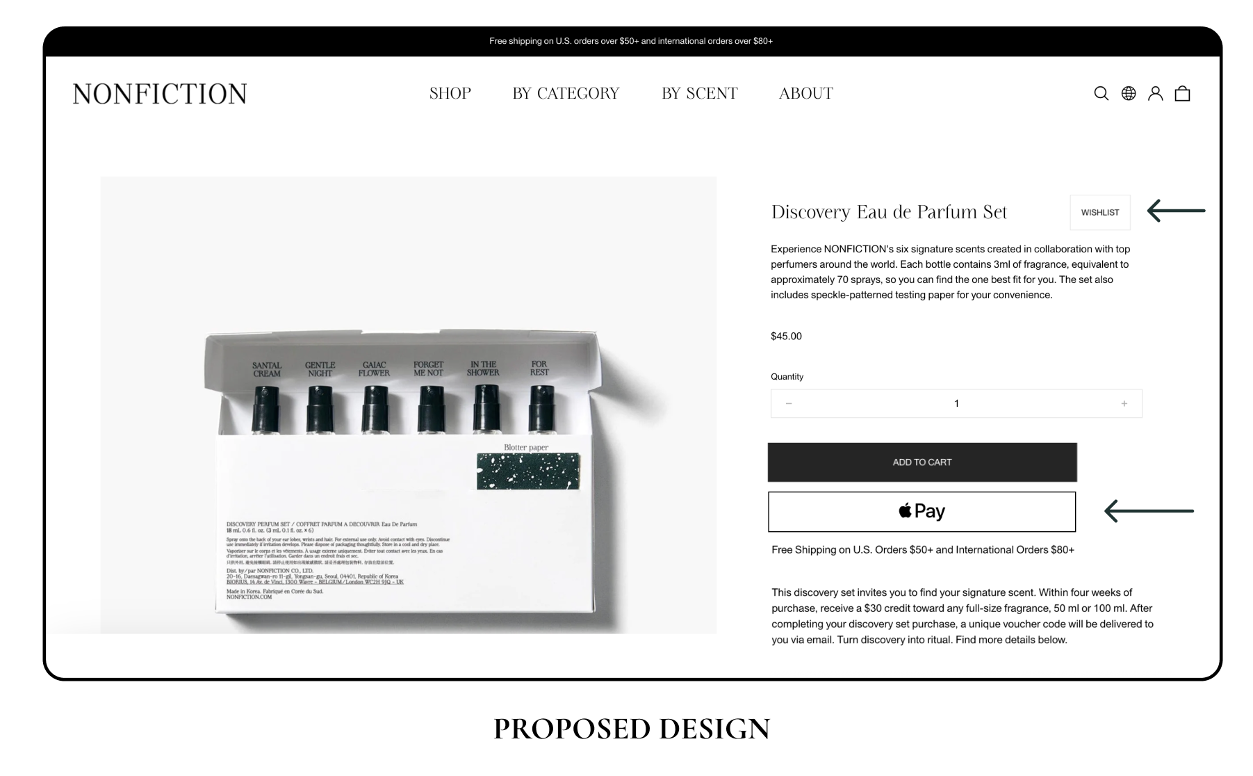
The PDP's primary action area was crowded with mixed-intent controls. Wishlist sat alongside Add to Cart, splitting attention between buy now and save for later at the exact moment the user was deciding. Returning customers — a meaningful slice of the existing Asian customer base — also had no accelerated checkout option, meaning every repeat purchase ran through the full form flow.

The proposal
  • Wishlist relocation. Move Wishlist up next to the product name, separating save-for-later intent from buy-now intent.
  • Two-button conversion zone. The primary CTA area becomes a clean decision, Add to Cart or Express Checkout.
  • Accelerated checkout. Add Apple Pay, Google Pay, and Shop Pay as a parallel primary action. Prior integrations have lifted checkout success by 30–35% for returning users by collapsing the form flow into a single biometric tap.
  • No rebuild required. Both changes reuse existing components and CSS tokens. Engineering scope sits inside a sprint.
Expected outcome

A 30–35% lift in checkout success for returning users, with the Wishlist relocation feeding the parallel save-for-later behavior proposed on the home page.

APV Optimization · Listing Grid

Cut the forced detour from browse to bag.

The listing grid had no visible Add to Cart on the product tile — just a 12×12 bag icon in the top-right corner that blended into the background. Every purchase forced a detour to the PDP, even for users who already knew what they wanted. The proposal: replace the hidden icon with a visible Wishlist control, and add a primary Add to Cart CTA directly under each product image.

1 Hidden CTA surfaced 12×12 bag icon → full text "ADD TO CART" button.
−1 Click removed from the funnel Browse → cart, no PDP detour required.
2 Save-for-later surfaces Listing grid + PDP, system-wide Wishlist behavior.
The audit found

The product tile in the listing grid was a dead end for buy-now intent. The only purchase control was a 12×12 bag icon in the upper-right corner, colored close enough to the background that it read as decorative rather than functional. Any user who wanted to add an item directly to their cart had to click into the PDP first, a forced detour through a screen they didn't need to see.

If the grid was designed as a discovery surface, it only served one mode of use. A meaningful slice of users, returning customers and refill shoppers, were treating it as a purchase surface, and the existing design didn't give them an affordance to act on that intent.

The proposal
  • Wishlist tag swap. Replace the hidden bag icon with a Wishlist tag icon, using a contrast color that reads clearly against the tile background. Save-for-later becomes obvious, intentional, and consistent with the PDP-level Wishlist relocation.
  • Visible Add to Cart. Add a full-width "ADD TO CART" CTA under each product image. Direct add-to-cart for known-intent users, no PDP detour required.
  • No new components needed. The Wishlist tag and Add to Cart button already exist in the design system. Engineering scope sits well inside a sprint.
Expected outcome

A faster browse-to-bag path for known-intent shoppers, paired with a system-wide Wishlist behavior that mirrors the PDP-level relocation in APV Optimization 1.

APV Optimization · Menu

Turn the menu into a merchandising surface.

The desktop nav was a static row of links with four icons stacked on the right (search, region, account, bag). It worked, but it was doing the bare minimum. Pure utility, no merchandising, no editorial. The proposal: consolidate the right-side icons, anchor the brand in the center, and open the hamburger into a full-screen menu that doubles as a marketing surface.

4 → 2 Right-side icons consolidated Search merged into hamburger · region removed.
1 Brand anchor restored "NONFICTION" wordmark centered for trust.
+1 Surface for merchandising Full-screen menu now carries editorial imagery and curated entry points.
The audit found

The current nav was symmetrical on the left (logo + links) and noisy on the right (four icons competing for attention). Search, region, account, and bag all read at the same visual weight, even though they serve very different intents. Region in particular was carrying weight it didn't need to — the North American site is regionally fixed, so the toggle was a decision the user didn't need to make. And the menu itself, when opened, surfaced only the link structure. No imagery, no merchandising, no editorial pathway. For a brand whose retail experience is highly considered, the digital nav was the least considered surface on the page.

The proposal
  • Consolidate right-side icons from four to two. Merge search into the hamburger menu as a combined "menu + search" control on the right. Remove the region toggle entirely, the North American site doesn't need it.
  • Center the brand wordmark. Move "NONFICTION" to the center of the nav, with the combined hamburger/search on one side and the account + bag icons on the other. The brand becomes the anchor of the page, not just a link in the corner.
  • Expand the hamburger into a full-screen merchandising surface. When opened, the menu uses the full canvas: New Arrivals, Best Sellers, and Gift Sets surface as named columns with curated item entries; Shop by Category and By Scent stay as the structured discovery paths; the right side of the canvas carries editorial imagery, the same brand language the retail experience uses.
  • No new components needed. Existing typography tokens, icons, and image styles. The hamburger overlay is one new container; everything inside it reuses what's already in the system.
Expected outcome

A nav that does three jobs at once: lets known-intent users find what they came for, surfaces curated entry points for browsers, and reinforces the brand at every page load. For a premium brand entering a new market, the menu becomes the most efficient marketing surface on the site, every user opens it, and every open is an opportunity to merchandise.

Acquisition Hooks

Recover the 10% coupon moment without taking over the screen.

The home page email capture was firing as a full-screen modal ten seconds after landing — too late for users who'd already moved to a PDP, and too aggressive for a first-time visitor to a premium brand. Customer service was absorbing the fallout: tickets about missing coupons were a regular escalation flagged by the CMO. The proposal: replace the takeover with a subtler nudge at the right moment, and add a second capture point at checkout for users who missed the first.

−1 Full-screen modal replaced Subtle lower-right card · in-flow inline form.
2 Capture points instead of one Home page (1–2 sec) + first checkout (account-less users).
CS ticket volume Eliminates the "missing coupon" escalation path the CMO flagged.
The audit found

The home page email modal was firing about ten seconds after landing — but a meaningful share of users were already inside a PDP within five seconds, meaning the modal either missed them entirely or interrupted them mid-browse. When it did fire, the full-screen takeover felt intrusive for a premium brand experience, especially for first-time North American visitors with no prior familiarity. The CMO also flagged a recurring CS escalation: users were contacting support after missing the 10% sign-up coupon, and the support team was absorbing the cost of a UX gap.

The proposal
  • Subtle nudge, not a takeover. Replace the full-screen modal with a card anchored to the lower-right corner, firing one to two seconds after the user lands on the home page. The card includes the email field inline — no second modal, no flow interruption.
  • Catch the missed users at checkout. For users who reach the first checkout without an account, surface the email sign-up form inline as part of the flow. The 10% bonus is granted at the point the user is already converting.
  • Resolves the CS escalation. The CMO's CS ticket pattern about missing coupons is eliminated at the source — users are offered the coupon at two natural moments instead of one easily-dismissed one.
  • No backend work required. Both surfaces use the existing email capture endpoint and bonus logic. Front-end-only lift.
Expected outcome

A higher email capture rate from non-disruptive surfacing, plus a second recovery point at checkout for users who missed the first. The CS team stops being the safety net for a UX failure, and the brand's first-touch impression stays consistent with the premium positioning.

How I worked.

No new product to ship, no new code to write. The job was to find what the existing site could do better, model the impact, and present it convincingly to leaders who all wanted different things from the same proposals.

Audit

Walked the funnel as a customer.

Annotated every screen as a customer would, home, PDP, cart, checkout, with friction points and missed opportunities. Eight intervention surfaces emerged, ranked by impact-to-effort ratio.

Constraint

Engineering cost as the filter.

Every proposal came with an engineering-cost estimate. "Lowest-eng" wasn't a nice-to-have, it was the gate. Anything that required a backend service didn't make the cut.

Stack

What the work used.

Figma Keynote Notion

A new industry, but the funnel works the same.

I was hesitant before taking this project, I'd never worked with a luxury lifestyle brand before, and the category seemed like it would carry its own design grammar. But as a designer who follows new and upcoming brands in the NYC area as a consumer, I was able to put on the customer's hat and pinpoint pain points that weren't hypothetical. They were the real frictions a North American shopper would actually hit on the path to purchase, the kind that directly cap APV and acquisition.

  • Audit before you propose. Walking the funnel as a customer surfaced things the stakeholders had stopped seeing. Familiarity breeds blindness; outside eyes are the asset.
  • Make engineering cost a first-class number. "How much will this cost to build?" was a question we answered before the presentation, not during. Treating engineering cost as a constraint, not a footnote, kept the proposals shippable.
  • Keep mocks light. Hi-fi mocks would have invited brand debates. Wireframe-level mocks kept the conversation on impact, not aesthetics.
  • Match the framing to the room. The same proposal lands differently with the CEO, CMO, and CCO. Naming the priority each leader cares about, brand integrity, growth, customer experience, turned three audiences into three champions.